The decision to call off strike has created a rift between the jewellers fraternity; the industry is singing two different tunes.
Ghanasingh Be True (GBT) is all about redefining luxury with unmatched craftsmanship and detail. It has an illustrious 109-year legacy of design and high quality service. They launched their first flagship store in Bandra, Waterfield Road in August 2012, which instantly pitted them amongst the top elite luxury jewellery salons to look out for. They have recently launched a new jewellery salon in Bandra which is excellence personified. Kunjal Karaniya explores the nuances of this the luxuriously designed store.%%
The design idea emerged from the idiom 'spoiling luxury'. “The brand, GBT was moving from a much larger space with a apparent perceptive to make the experience more personal and warm for their clientele which is very high-end and first-class,†informs Ar. Aftab Bandukwala from V-Design Architectural Solutions Pvt Ltd. The GBT evidently don't flourish on the mass market. Their product is exclusive and their buyer very astute. “We know the difference between the business of clients such as Tanishq and GBT as we have been in the business of designing jewellery stores long enough. The Tanishq model is a volume driven business while GBT are in the business of creating heirlooms and bespoke pieces,†adds Ar. Aftab Bandukwala. %%
A look towards the entrance and one knows you are about to step into a lavish fairytale set up. The entrance that is lavishly laid with the most premium Statuario white marble with a lattice of delicate grey veins imported from Italy and the exquisite Bohemia crystal chandeliers to the entirely mirror clad counters and wall display embellished in Asfour crystals, the experience created is to make the client that comes from no less surroundings, feel completely at home. Gautam Ghanasingh, Creative Director, Ghanasingh Be True says, “The interior of the jewellery salon is inspired by the Laduree in Paris and is a work of art in itself, almost like a sublime throne on which the exquisite jewels sit avant-garde in style. The entrance is lavishly laid with the most premium Statuario white marble imported from Italy, beckoning you inside with its fanciness. The first thing that catches your eye is a painting by MF Hussain. As you move along after inspecting this masterpiece you can’t help but be caught in the dance of the warm rich lightings cast by the champagne coloured Bohemian chandelier which illuminates the Italian marble giving this address it’s ethereal and regal feel. Our jewellery is placed in a bed of rich velvet allowing the jewellery to sparkle to its complete capacity and giving the customers a lucid idea of the pieces.†%%
This jewellery salon is truly La Grande Elegance doing absolute justice to the astoundingly beautiful precious stones and pieces that shimmer inside with life. He further adds, “Our jewellery salon makes a person feel like they are in a treasure island willingly getting lost in all the dazzle and shimmer. Offering exquisite and custom made designs to fit for every customer while having all the pieces set in pure gold with rare and dazzling stones makes our store unique and stylish. Our knowledgeable staff makes sure that you not only feel welcomed and at ease, but also help you completely engage in this crème de la crème experienceâ€. The store has a ground floor and first floor and is spread in the area of 1,200 sq. ft. The brand is also fortunate that it can boast of having a beautiful promenade as their frontage, which definitely adds to the appeal for the elegant client experience. %%
Highlighting the most important aspect – colours, Ar. Aftab Bandukwala shares, “We chose grey and a soft light peach, which is completely in sync with their brand positioning and overall customer experience of modest yet luxurious. We kept the entire theme as shell white, including the veneer paneling which is in a light distressed white PU, as we certainly did not want to go away from this paletteâ€. %%
“The display niches are dressed in an elegant peach taffeta silk which offers a finely lavish luster without overpowering the jewellery. The point that we at VDASPL keep at the front of our design principles is that the product is the core; whatever else we do must fade in consequence. The taffeta is softened with a chesterfield quilting. They wanted to use bohemian crystal buttons on the quilting but understood our reluctance when we pointed out that it should only be the diamonds that glitter. For the product lighting we took a brave decision to use a neutral white lighting of 4000 Kelvin as against the usual choice of full white lighting of 6000 Kelvin,†says Ar. Aftab Bandukwala. Diamond jewellery retailers prefer the latter as it gives a bright sparkle to the stones. “But we do not recommend it as it tends to look very artificial. Also, this store was all about softness and white light would have been very harsh and stark. One more decision that they supported and were happy about was to further enhance the brand positioning and to break the monotony of rectangular niches and we did this through designing a few niches in the form of their logo, which is the silhouette of a Victorian mirror,†shares the architect. This further softens the backdrop and brings brand recollect. %%
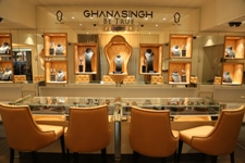
Talking about the counters, Bandukwala states, “We were sure that there was no scope for any other polish colour, but white seemed very uninteresting and over used already in the rest of the interiors, so we decided to use a mirror. This was a simple and beautiful solution. The mirror would take on the colours of the surrounding without conflicting with any of its own and made the otherwise bulky counters in the small space completely disappear. Hence once again only the product stands out. We gave an edge of sophistication to the mirror by embellishing it with Asfour crystals. We followed the same concept on the wall units in a way that only the delicate peach niches stand out; seemingly floating on the wall with the jewellery in pride of position.†%%
Coming to the customer chairs, the architect chose soft and curvaceous fully upholstered period design which added style to the interiors but were not too flouncy and overpowering the entire interior design. The chairs are upholstered in the same peach taffeta silk and the back has a chesterfield diamond cushioning, this time with the bohemia crystals as the buttons. The back has pretty brass studs lining the profile giving it a very finished look. %%
Talking about the facilities offered, Gautam Ghanasingh says, “The high-end premium buyers are not only treated to a dazzling display of diamonds and precious gems but are led to the beautiful spacious enclosure where they along with their accompaniments can wait till the transaction of their buy is processed all the while being treated to an experience befitting royalty. Boutiques of this nature are usually a bit intimidating but the well presented and knowledgeable service staff and handlers make sure that you feel welcomed and at ease, helping you completely engage in this crème de la crème experience.†He further adds, “All the jewellery perfectly reflects the harmony between modern design and traditional craftsmanship, something that is much appreciated in today’s times. We focus on providing our customers with an uninhibited and sparkling voyage into our world of exquisite jewellery pieces. Trained staff at every vertical for the right experience engages with our clients. We have designing experts who sit with our clients till they complete that one jewellery pieces that can bring the smile on the client’s face. We do what we need to do to ensure our client goes home happy. This is difficult but not impossible to achieve.†%%
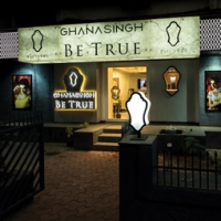
Trying to know more about the design story, we asked the architect to explain the nuances behind the façade. To this answered, “It is the piece de resistance, as in any of our projects. We believe that the store must make a statement from far and wide, which is well associated with the brand and the products it holds within, while being audacious and an eye-turner. We offered façades which offer a different look during the day from what it appears in the night when fully lit. Besides our own design thought, the store demanded it as much as needed to be very visible. The façade is 65 feet in length and gave a wonderful palette for us to work with. However, a large ugly bus stop with bright backlit visuals stands right outside the store in full-blown ugliness! We had to surpass it without making it look gaudy like an obtuse departmental store. We chose to use backlit faux marble for the main signage with the signage in plain black letters pasted on it.†%%
During the day, the façade looks like an elegant signage in marble with simple letters. In the evening, however, once the marble is backlit, the letters become a shadow and the signage completely transforms into a different feel from what it offers during the day. The rest of the length of the store has been clad in a black back painted glass latticed in a white design formed from the logo of the brand. This too is backlit and in the night the black glass disappears and the lattice stands out brightly lit. The entrance to the store is flanked by just one display window in the same form as their logo on the right and the signage in reverse lit channel letters in black. The backdrop is in sliver-fluted paneling, which adds a subtle dazzle without adding any unwanted colour. “Since the store is especially boutique, we have kept the glazing to a minimum, with only one large picture window revealing the inside retail space, fringed with rich silver grey drapes and light translucent silver sheers which are mostly gathered with a jewelled sash decked in crystals and pearls,†says Ar. Aftab Bandukwala. %%
“Ghanasingh Be True is a remarkable project in our diverse portfolio of various jewellery stores that without doubt says ‘come in and let us make you feel special… let us spoil you while you spoil yourself’,†proudly says Ar. Aftab Bandukwala. The privacy, the understated elegance and the soft feminine feel all make Ghanasingh Be True a retail experience that is unparalleled. %%

Ghanasingh Be True (GBT) is all about redefining luxury with unmatched craftsmanship and detail. It has an illustrious 109-year legacy of design and high quality service. They launched their first flagship store in Bandra, Waterfield Road in August 2012, which instantly pitted them amongst the top elite luxury jewellery salons to look out for. They have recently launched a new jewellery salon in Bandra which is excellence personified. Kunjal Karaniya explores the nuances of this the luxuriously designed store.%%
The design idea emerged from the idiom 'spoiling luxury'. “The brand, GBT was moving from a much larger space with a apparent perceptive to make the experience more personal and warm for their clientele which is very high-end and first-class,†informs Ar. Aftab Bandukwala from V-Design Architectural Solutions Pvt Ltd. The GBT evidently don't flourish on the mass market. Their product is exclusive and their buyer very astute. “We know the difference between the business of clients such as Tanishq and GBT as we have been in the business of designing jewellery stores long enough. The Tanishq model is a volume driven business while GBT are in the business of creating heirlooms and bespoke pieces,†adds Ar. Aftab Bandukwala. %%
A look towards the entrance and one knows you are about to step into a lavish fairytale set up. The entrance that is lavishly laid with the most premium Statuario white marble with a lattice of delicate grey veins imported from Italy and the exquisite Bohemia crystal chandeliers to the entirely mirror clad counters and wall display embellished in Asfour crystals, the experience created is to make the client that comes from no less surroundings, feel completely at home. Gautam Ghanasingh, Creative Director, Ghanasingh Be True says, “The interior of the jewellery salon is inspired by the Laduree in Paris and is a work of art in itself, almost like a sublime throne on which the exquisite jewels sit avant-garde in style. The entrance is lavishly laid with the most premium Statuario white marble imported from Italy, beckoning you inside with its fanciness. The first thing that catches your eye is a painting by MF Hussain. As you move along after inspecting this masterpiece you can’t help but be caught in the dance of the warm rich lightings cast by the champagne coloured Bohemian chandelier which illuminates the Italian marble giving this address it’s ethereal and regal feel. Our jewellery is placed in a bed of rich velvet allowing the jewellery to sparkle to its complete capacity and giving the customers a lucid idea of the pieces.†%%
This jewellery salon is truly La Grande Elegance doing absolute justice to the astoundingly beautiful precious stones and pieces that shimmer inside with life. He further adds, “Our jewellery salon makes a person feel like they are in a treasure island willingly getting lost in all the dazzle and shimmer. Offering exquisite and custom made designs to fit for every customer while having all the pieces set in pure gold with rare and dazzling stones makes our store unique and stylish. Our knowledgeable staff makes sure that you not only feel welcomed and at ease, but also help you completely engage in this crème de la crème experienceâ€. The store has a ground floor and first floor and is spread in the area of 1,200 sq. ft. The brand is also fortunate that it can boast of having a beautiful promenade as their frontage, which definitely adds to the appeal for the elegant client experience. %%
Highlighting the most important aspect – colours, Ar. Aftab Bandukwala shares, “We chose grey and a soft light peach, which is completely in sync with their brand positioning and overall customer experience of modest yet luxurious. We kept the entire theme as shell white, including the veneer paneling which is in a light distressed white PU, as we certainly did not want to go away from this paletteâ€. %%
“The display niches are dressed in an elegant peach taffeta silk which offers a finely lavish luster without overpowering the jewellery. The point that we at VDASPL keep at the front of our design principles is that the product is the core; whatever else we do must fade in consequence. The taffeta is softened with a chesterfield quilting. They wanted to use bohemian crystal buttons on the quilting but understood our reluctance when we pointed out that it should only be the diamonds that glitter. For the product lighting we took a brave decision to use a neutral white lighting of 4000 Kelvin as against the usual choice of full white lighting of 6000 Kelvin,†says Ar. Aftab Bandukwala. Diamond jewellery retailers prefer the latter as it gives a bright sparkle to the stones. “But we do not recommend it as it tends to look very artificial. Also, this store was all about softness and white light would have been very harsh and stark. One more decision that they supported and were happy about was to further enhance the brand positioning and to break the monotony of rectangular niches and we did this through designing a few niches in the form of their logo, which is the silhouette of a Victorian mirror,†shares the architect. This further softens the backdrop and brings brand recollect. %%
Talking about the counters, Bandukwala states, “We were sure that there was no scope for any other polish colour, but white seemed very uninteresting and over used already in the rest of the interiors, so we decided to use a mirror. This was a simple and beautiful solution. The mirror would take on the colours of the surrounding without conflicting with any of its own and made the otherwise bulky counters in the small space completely disappear. Hence once again only the product stands out. We gave an edge of sophistication to the mirror by embellishing it with Asfour crystals. We followed the same concept on the wall units in a way that only the delicate peach niches stand out; seemingly floating on the wall with the jewellery in pride of position.†%%
Coming to the customer chairs, the architect chose soft and curvaceous fully upholstered period design which added style to the interiors but were not too flouncy and overpowering the entire interior design. The chairs are upholstered in the same peach taffeta silk and the back has a chesterfield diamond cushioning, this time with the bohemia crystals as the buttons. The back has pretty brass studs lining the profile giving it a very finished look. %%

Talking about the facilities offered, Gautam Ghanasingh says, “The high-end premium buyers are not only treated to a dazzling display of diamonds and precious gems but are led to the beautiful spacious enclosure where they along with their accompaniments can wait till the transaction of their buy is processed all the while being treated to an experience befitting royalty. Boutiques of this nature are usually a bit intimidating but the well presented and knowledgeable service staff and handlers make sure that you feel welcomed and at ease, helping you completely engage in this crème de la crème experience.†He further adds, “All the jewellery perfectly reflects the harmony between modern design and traditional craftsmanship, something that is much appreciated in today’s times. We focus on providing our customers with an uninhibited and sparkling voyage into our world of exquisite jewellery pieces. Trained staff at every vertical for the right experience engages with our clients. We have designing experts who sit with our clients till they complete that one jewellery pieces that can bring the smile on the client’s face. We do what we need to do to ensure our client goes home happy. This is difficult but not impossible to achieve.†%%
Trying to know more about the design story, we asked the architect to explain the nuances behind the façade. To this answered, “It is the piece de resistance, as in any of our projects. We believe that the store must make a statement from far and wide, which is well associated with the brand and the products it holds within, while being audacious and an eye-turner. We offered façades which offer a different look during the day from what it appears in the night when fully lit. Besides our own design thought, the store demanded it as much as needed to be very visible. The façade is 65 feet in length and gave a wonderful palette for us to work with. However, a large ugly bus stop with bright backlit visuals stands right outside the store in full-blown ugliness! We had to surpass it without making it look gaudy like an obtuse departmental store. We chose to use backlit faux marble for the main signage with the signage in plain black letters pasted on it.†%%
During the day, the façade looks like an elegant signage in marble with simple letters. In the evening, however, once the marble is backlit, the letters become a shadow and the signage completely transforms into a different feel from what it offers during the day. The rest of the length of the store has been clad in a black back painted glass latticed in a white design formed from the logo of the brand. This too is backlit and in the night the black glass disappears and the lattice stands out brightly lit. The entrance to the store is flanked by just one display window in the same form as their logo on the right and the signage in reverse lit channel letters in black. The backdrop is in sliver-fluted paneling, which adds a subtle dazzle without adding any unwanted colour. “Since the store is especially boutique, we have kept the glazing to a minimum, with only one large picture window revealing the inside retail space, fringed with rich silver grey drapes and light translucent silver sheers which are mostly gathered with a jewelled sash decked in crystals and pearls,†says Ar. Aftab Bandukwala. %%
“Ghanasingh Be True is a remarkable project in our diverse portfolio of various jewellery stores that without doubt says ‘come in and let us make you feel special… let us spoil you while you spoil yourself’,†proudly says Ar. Aftab Bandukwala. The privacy, the understated elegance and the soft feminine feel all make Ghanasingh Be True a retail experience that is unparalleled. %%

Ghanasingh Be True (GBT) is all about redefining luxury with unmatched craftsmanship and detail. It has an illustrious 109-year legacy of design and high quality service. They launched their first flagship store in Bandra, Waterfield Road in August 2012, which instantly pitted them amongst the top elite luxury jewellery salons to look out for. They have recently launched a new jewellery salon in Bandra which is excellence personified. Kunjal Karaniya explores the nuances of this the luxuriously designed store.%%
The design idea emerged from the idiom 'spoiling luxury'. “The brand, GBT was moving from a much larger space with a apparent perceptive to make the experience more personal and warm for their clientele which is very high-end and first-class,†informs Ar. Aftab Bandukwala from V-Design Architectural Solutions Pvt Ltd. The GBT evidently don't flourish on the mass market. Their product is exclusive and their buyer very astute. “We know the difference between the business of clients such as Tanishq and GBT as we have been in the business of designing jewellery stores long enough. The Tanishq model is a volume driven business while GBT are in the business of creating heirlooms and bespoke pieces,†adds Ar. Aftab Bandukwala. %%
A look towards the entrance and one knows you are about to step into a lavish fairytale set up. The entrance that is lavishly laid with the most premium Statuario white marble with a lattice of delicate grey veins imported from Italy and the exquisite Bohemia crystal chandeliers to the entirely mirror clad counters and wall display embellished in Asfour crystals, the experience created is to make the client that comes from no less surroundings, feel completely at home. Gautam Ghanasingh, Creative Director, Ghanasingh Be True says, “The interior of the jewellery salon is inspired by the Laduree in Paris and is a work of art in itself, almost like a sublime throne on which the exquisite jewels sit avant-garde in style. The entrance is lavishly laid with the most premium Statuario white marble imported from Italy, beckoning you inside with its fanciness. The first thing that catches your eye is a painting by MF Hussain. As you move along after inspecting this masterpiece you can’t help but be caught in the dance of the warm rich lightings cast by the champagne coloured Bohemian chandelier which illuminates the Italian marble giving this address it’s ethereal and regal feel. Our jewellery is placed in a bed of rich velvet allowing the jewellery to sparkle to its complete capacity and giving the customers a lucid idea of the pieces.†%%
This jewellery salon is truly La Grande Elegance doing absolute justice to the astoundingly beautiful precious stones and pieces that shimmer inside with life. He further adds, “Our jewellery salon makes a person feel like they are in a treasure island willingly getting lost in all the dazzle and shimmer. Offering exquisite and custom made designs to fit for every customer while having all the pieces set in pure gold with rare and dazzling stones makes our store unique and stylish. Our knowledgeable staff makes sure that you not only feel welcomed and at ease, but also help you completely engage in this crème de la crème experienceâ€. The store has a ground floor and first floor and is spread in the area of 1,200 sq. ft. The brand is also fortunate that it can boast of having a beautiful promenade as their frontage, which definitely adds to the appeal for the elegant client experience. %%
Highlighting the most important aspect – colours, Ar. Aftab Bandukwala shares, “We chose grey and a soft light peach, which is completely in sync with their brand positioning and overall customer experience of modest yet luxurious. We kept the entire theme as shell white, including the veneer paneling which is in a light distressed white PU, as we certainly did not want to go away from this paletteâ€. %%
“The display niches are dressed in an elegant peach taffeta silk which offers a finely lavish luster without overpowering the jewellery. The point that we at VDASPL keep at the front of our design principles is that the product is the core; whatever else we do must fade in consequence. The taffeta is softened with a chesterfield quilting. They wanted to use bohemian crystal buttons on the quilting but understood our reluctance when we pointed out that it should only be the diamonds that glitter. For the product lighting we took a brave decision to use a neutral white lighting of 4000 Kelvin as against the usual choice of full white lighting of 6000 Kelvin,†says Ar. Aftab Bandukwala. Diamond jewellery retailers prefer the latter as it gives a bright sparkle to the stones. “But we do not recommend it as it tends to look very artificial. Also, this store was all about softness and white light would have been very harsh and stark. One more decision that they supported and were happy about was to further enhance the brand positioning and to break the monotony of rectangular niches and we did this through designing a few niches in the form of their logo, which is the silhouette of a Victorian mirror,†shares the architect. This further softens the backdrop and brings brand recollect. %%
Talking about the counters, Bandukwala states, “We were sure that there was no scope for any other polish colour, but white seemed very uninteresting and over used already in the rest of the interiors, so we decided to use a mirror. This was a simple and beautiful solution. The mirror would take on the colours of the surrounding without conflicting with any of its own and made the otherwise bulky counters in the small space completely disappear. Hence once again only the product stands out. We gave an edge of sophistication to the mirror by embellishing it with Asfour crystals. We followed the same concept on the wall units in a way that only the delicate peach niches stand out; seemingly floating on the wall with the jewellery in pride of position.†%%
Coming to the customer chairs, the architect chose soft and curvaceous fully upholstered period design which added style to the interiors but were not too flouncy and overpowering the entire interior design. The chairs are upholstered in the same peach taffeta silk and the back has a chesterfield diamond cushioning, this time with the bohemia crystals as the buttons. The back has pretty brass studs lining the profile giving it a very finished look. %%

Talking about the facilities offered, Gautam Ghanasingh says, “The high-end premium buyers are not only treated to a dazzling display of diamonds and precious gems but are led to the beautiful spacious enclosure where they along with their accompaniments can wait till the transaction of their buy is processed all the while being treated to an experience befitting royalty. Boutiques of this nature are usually a bit intimidating but the well presented and knowledgeable service staff and handlers make sure that you feel welcomed and at ease, helping you completely engage in this crème de la crème experience.†He further adds, “All the jewellery perfectly reflects the harmony between modern design and traditional craftsmanship, something that is much appreciated in today’s times. We focus on providing our customers with an uninhibited and sparkling voyage into our world of exquisite jewellery pieces. Trained staff at every vertical for the right experience engages with our clients. We have designing experts who sit with our clients till they complete that one jewellery pieces that can bring the smile on the client’s face. We do what we need to do to ensure our client goes home happy. This is difficult but not impossible to achieve.†%%
Trying to know more about the design story, we asked the architect to explain the nuances behind the façade. To this answered, “It is the piece de resistance, as in any of our projects. We believe that the store must make a statement from far and wide, which is well associated with the brand and the products it holds within, while being audacious and an eye-turner. We offered façades which offer a different look during the day from what it appears in the night when fully lit. Besides our own design thought, the store demanded it as much as needed to be very visible. The façade is 65 feet in length and gave a wonderful palette for us to work with. However, a large ugly bus stop with bright backlit visuals stands right outside the store in full-blown ugliness! We had to surpass it without making it look gaudy like an obtuse departmental store. We chose to use backlit faux marble for the main signage with the signage in plain black letters pasted on it.†%%
During the day, the façade looks like an elegant signage in marble with simple letters. In the evening, however, once the marble is backlit, the letters become a shadow and the signage completely transforms into a different feel from what it offers during the day. The rest of the length of the store has been clad in a black back painted glass latticed in a white design formed from the logo of the brand. This too is backlit and in the night the black glass disappears and the lattice stands out brightly lit. The entrance to the store is flanked by just one display window in the same form as their logo on the right and the signage in reverse lit channel letters in black. The backdrop is in sliver-fluted paneling, which adds a subtle dazzle without adding any unwanted colour. “Since the store is especially boutique, we have kept the glazing to a minimum, with only one large picture window revealing the inside retail space, fringed with rich silver grey drapes and light translucent silver sheers which are mostly gathered with a jewelled sash decked in crystals and pearls,†says Ar. Aftab Bandukwala. %%
“Ghanasingh Be True is a remarkable project in our diverse portfolio of various jewellery stores that without doubt says ‘come in and let us make you feel special… let us spoil you while you spoil yourself’,†proudly says Ar. Aftab Bandukwala. The privacy, the understated elegance and the soft feminine feel all make Ghanasingh Be True a retail experience that is unparalleled. %%


Be the first to comment